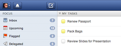
Today we released a fairly substantial visual update to Flow’s header. While this introduces no new functionality, we thought it might interest some to know what changes we made and why we made them.

Branding Be Gone
The biggest change you’ll notice is the removal of our logo, which we found to be largely superfluous, unnecessarily reenforcing our brand in-app, and offering no useful functionality. Websites use their logo as a shortcut to their home page, but with Flow, there really is no home screen—by default, you start Flow on the last task page or list you were viewing. Flow really isn’t a website—it’s a web_app_. And apps typically save chrome real-estate for more important functions or white space.
New Button Styles
You may now notice that all the buttons look the same. Gone are the stand-alone icons on the right and smaller, connected buttons on the left, replaced with a more standardized look, more inline with the other buttons in Flow. Besides offering a more unified look, the new buttons will also be more inline with our eventual mobile web app and iPhone app redesign, bringing more cohesion to the Flow App Family.
Combined Preferences Menu
Finally, we merged the support and preferences menus into a single menu, marked by the logged-in user’s avatar. By doing so we’ve decreased the number of buttons in the header, encouraged users to upload an avatar, and promoted the social aspect of Flow.
We hope you enjoy these changes and think they’re as dashing as we do.